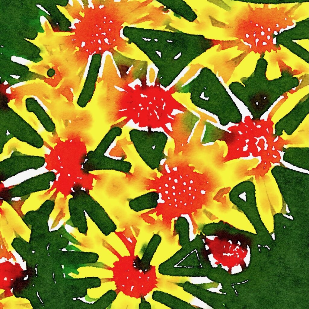
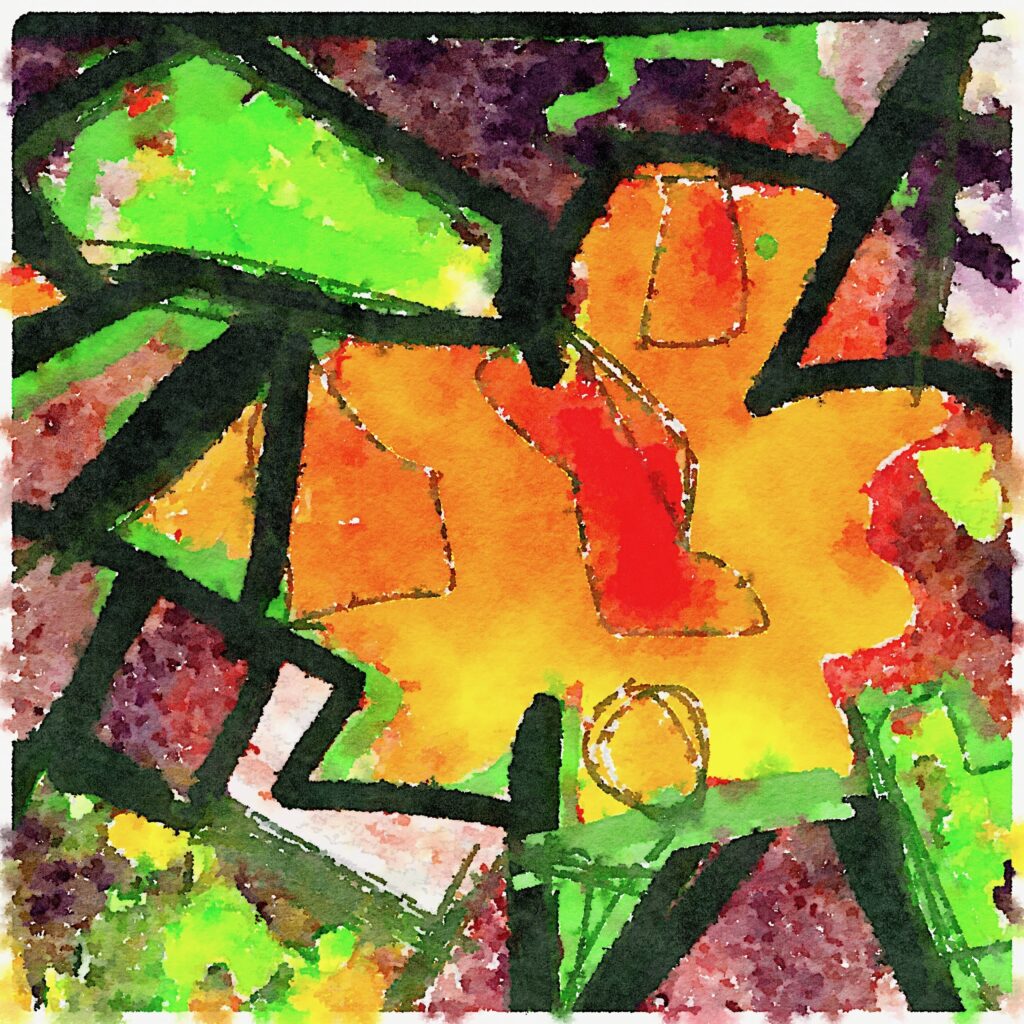
Sketching again! Flower Power.

Its been a while, and I won’t have many as I’m working on some serious writing projects, but have loved doing these as I am more rested over the holiday period.

I’m on a roll here… they could be a series.  The aim is to make flowers, not… I know… flower power.


International Klein Blue


I thought that Yves Klein’s Blue must have been the purest blue #0000ff, all the blues and nothing else.

But not so. I discovered that IKB is in fact #002FA7

I have just made all the un-clicked links on this blog IKB. The visited ones are light blue.

  #0000ff – Mathematially pure blue?
  #002FA7 – International Klein Blue
  #8B8BFF – mid-point light blue      

Pattern

I am keen to see how these two look in the “viewer”. I completed the Green and then changed the hue. I think they might go well as a pair.

I was inspired to do these when I used a small 10×15 print of this one as a bookmark: Pattern (#0926 in Thousand Sketches)

Both digital images.

Later: Tuesday, 13 May, 2008 – added a few more.

svgallery=2008-04-29-pattern

Transition Contours

svgallery=2008-02-22-mix

I can imagine printing these three and sticking them to a heavy paper and giving the lot a thick cover of gloss.

What do you think?

Later: I am doing just that today, Friday, 21 March, 2008 harder than I thought, the buckling, as you might have guessed. Canvas on canvas? I have printed on canvas using my Epson R2400 but it is blurry, I need to get the profile right, how do I do that?

Maybe get as roll of wall paper? Paper on paper?

Book Review using hreview

book

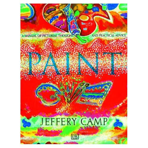
Paint, A Manual of Pictorial Thought & Practical Advice

I am reading it today

A messy rambling book both in its images, text and layout, but interesting and inspiring in that it makes it all look doable.

This is from the Amazon site, and puts it well:

From Library Journal:

Most art manuals tend toward large, impressive photos with little text. This one is packed with 1500 illustrations and an unusually rich text. Camp’s style tends to personal observation, autobiographical touches, references to art history, and fresh inspiration. A teacher at the Slade School of Fine Art, London, and a member of the Royal Academy of Arts, he believes in copying from masters but avoiding academic dryness. Libraries should also consider his previous, excellent work Draw: How To Master the Art (DK, 1994).
Copyright 1996 Reed Business Information, Inc.

My rating: 3.5 stars
***1/2

Albers Colour Theory

AlbersExplanation

img

The picture to the left, originally made by Josef Albers is a great example of how color is deceiving. We need to train our eyes to understand what is happening. It is color interacting. The picture looks like four different colored squares with a transparent folded square on top of them. The transparency is actually just different blocks of color that are just slightly different then their surroundings, placed on top of the squares. Ultimately you have to remember that color is absolute and that it is always relative to its sorroundings.

Here is the book on Amazon:
Interaction of Color

Quote from an Amazon review:

the original had 150 color plates this version has only 8 in mine. The visual phenomena are so complex that without the plates you can’t possibly accurately understand what the book is talking about.

Now I want this hardback, but it’s rarity makes it over the top expensive.

Interaction of Color: Text of the Original Edition With Revised Plate Section (Hardcover)

Perhaps the solution is the paperback plus the CD ROM.

Or the book by his teacher: The Elements of Color (Hardcover) by Johannes Itten After reading this review, I don’t think so, it sounds dated and wrong:

Unless the reader is studious and very serious about trying to unearth the information contained in this book, he or she is much better served by studing Albers or others. Too bad there is no editing, no index, and no glossary.

~

What does Albers art look like:

All I could find but interesting IMO.