I photographed some of my acrylic 600 x 600 paintings. Here is an Earth Cross and a detail. Following that are more. I have posted these before, but these images are better.

Earth Crosses
Larger Image.

Earth Crosses
Larger Image.
Walter Logeman: Journal
I photographed some of my acrylic 600 x 600 paintings. Here is an Earth Cross and a detail. Following that are more. I have posted these before, but these images are better.
Earth Crosses
Larger Image.
Earth Crosses
Larger Image.
svgallery=2008-06-33-june
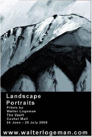
The show is on. All week Landscape Portraits have been on the walls at the café in the design store. On Tuesday lunchtime we celebrated the “opening ” with a bunch of friends.

I’ll put more photos up soon.
Here is the wording in that card on the wall.
Continue reading “Landscapes at The Daily Grind / The Vault”
Tired, too much to do, but got this one as I diverted from the essentials.

Red texture
Larger Image.
Square version follows. I prefer it!
I have tweaked the Gallery considerably. It now has my current draft Bio and My Art statement. (comments on that welcome as I am about to use those more in various places!)
I am working on adding links from the images ion the gallery to their original appearance in a blog post. It is in the blog post that there is more info about the context and where there may be discussion about the image.
I use a flash plugin: SimpleViewer. Great for ease of use. I think I may need to get the pro version… anyone familiar with that? I’ve manually entered what I want in the first three images in the Flax page in the Gallery.
I worked hard today painting in acrylics. Not much to show for it, nothing to post here in real media, (still waiting for my camera, it arrived from Hong Kong but its at the airport till Monday, but there is nothing to photograph anyway.) I was trying to translate a #0736 Trees from the Thousand Sketches and it was hard. This sort of digital to physical is a challenge.
One thing I did, in a moment of frustration with real paint, was a new digital. It just flew out. It is like the one I was using for a reference, with a subtly different feel.

Bush
Larger Image.
It is now obvious why I found it hard. The mottled effect is done digitally by setting the paper to very rough on those layers. The light spots are pits in the “paper”. Maybe I need to forget about being too true to my digital version & go with the medium? Or maybe persist?
How would you do this in acrylic?
Question:
In a Limited Edition of digital prints can some be landscape and others square? Is it wrong to meddle with the original file if it is still used to print more in that edition?
Answer:
There is no right or wrong here, who would decide? I have two principles I adhere to:
1. Relationship!
The purchaser has a say. If I have a square one and a landscape version, there is a choice. A purchaser may also have a choice about the size, why not? It is not all democracy. Some prints I just like one way, and I won’t sign what I am not happy to sign.
Now here is an hypothetical situation, one that is possible. Someone owns a print of mine from say a year or two ago, and sees it on my site in a form that they like better… relationship! Talk to me. I may print another one, or replace the old one.
2. Trust.
Editions are what they say they are: usually limited to 25. I stick to that. I will never sell a print below the price of the last one sold in the edition. Prints in the editions may vary a little, one from the other. For one, I sign them on the date I print them, to honour the fact that each print is an actual work, the file is just a file.
You may also be interested in my copyright notice
I have heard that traditionally the square format is meant to be hard to compose. Maybe. I am working on my new Gallery, and for some reason I want all images to be square. Not just in the Gallery, I think it began with the prints. I wonder how long this itch will take to scratch?
The Gallery has images from Thousand Sketches and also new ones. Wherever they have been shown before, in whatever format, now they are also square.

What do you think?
I am slowly finding more artists who do digital work that impresses me. Lisa Rivas is one. Mud Pie e-stamps for the WWW
This is one of my favourites, it looks good and it is a really quirky collectible concept!

I thought that Yves Klein’s Blue must have been the purest blue #0000ff, all the blues and nothing else.
But not so. I discovered that IKB is in fact #002FA7
| #0000ff – Mathematially pure blue? | |
| #002FA7 – International Klein Blue | |
| #8B8BFF – mid-point light blue |